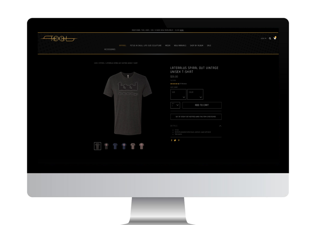
Project Overview –
Project Duration:
July 2023 – July 2023

Merchandise customization flow (for my favorite band).
The option to customize merchandise will personalize the customer experience for
these users and forge an even stronger bond between them and the band.
My favorite band’s website has a complex navigation menu and a standard merchandise flow.
Both issues are bound to deter fans and customers from utilizing the site to its fullest.
My goal is twofold:
First, simplify the navigation menu.
Second, hijack their aesthetic and the merchandise flow and insert a customization option.
My role:
UX designer from conception to delivery…
Interviews
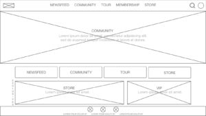
Paper and digital wireframes
Low & high-fidelity prototypes
Usability studies
Accessibility design
Iterating on designs
User research:
We interviewed several users (Online shoppers, music fans, & 3rd party vendors)
that have purchased customized merchandise in the past from various sites,
and intend to make similar purchases in the near future.
Many expressed a desire to see a test version of the customization before committing to the sale.
The impact of this design change, however, did not become clear until the third usability study was concluded.
To enhance the user experience I would also need to satisfy the new costing demands.
Pain Points
Quality – Cost – Shipping
Quality control of final product often
does not meet expectations.
Higher prices to cover the additional turnaround time
required in providing a sample product often proves
too costly to be a viable feature.
Delays in shipping, the wrong or damaged packaging…
it all has an obvious and detrimental effect on user experience
(potentially for multiple parties simultaneously).
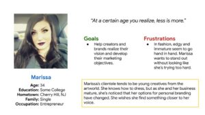
Marissa is an image-conscious entrepreneur who wants to support
her favorite band but doesn’t appreciate excessive branding.
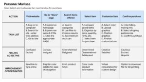
The initial design solution assumed that a merchandise customization flow was
just a matter of stringing together the correct customization options, but this was not the case.
Where we offered the feature had a huge impact.
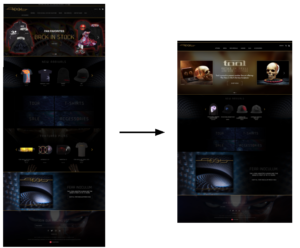
My first concern was to have the design solution match-up to the existing site as seamlessly as possible –
hence, gaining insight into the mindset of the original designer(s), and then iterating improvements.

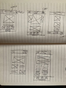
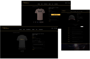
The first two usability studies uncovered features for the customization flow that I had overlooked,
like ‘placement’ of the graphics, which required its own dedicated screen, seen here.
I conducted three rounds of usability testing – The first two guided the designs from wireframes to mockups.
And the third revealed what aspects of the mockups needed improvement after testing a high-fidelity prototype.
Round 1 findings
‘Graphics Placement’ as an option overlooked.
Billing interface needs improving.
Round 2 findings
‘Sample’ option requested.
Round 3 findings
‘Sample’ option cost prohibitive.
Text needs to be bigger.
Based on the insights from the usability study, I decided to move
the ‘New Game’ link to the home screen and styled it to be more prominent.
“Sometimes, your vision doesn’t match their quality.”
Going through the process matters.
As useful and impactful as user research can be, without the proper context –
the practical interests of key stakeholders can be overlooked, creating a deficit in the user experience.
In order for the band to absorb the additional costs of time & money,
the option for merchandise customization should be an additional benefit for
the fanclub members – to diffuse the costs among those already paying a yearly membership fee.
Work on ‘Shop’ design solution, it’s a bit sparse and sterile.
Thank you for your time and your attention. I truly appreciate it.
Email: [email protected]